 DE
DE
 EN
ENThe Evolution of Responsive Web Design
THE EARLIEST DAYS
A lot of today’s internet users can hardly even imagine how websites used to look. Back in the days, websites were pretty straightforward. Designers didn’t have to worry a lot about the look of their websites. Rules were simple – If I want my website to have that element, I’ll just put it there, and every visitor will see it there. That rule was frankly easy to follow because most users surfed the web on their PCs with just a handful of resolutions and aspect ratios. It may sound like a surprise, but most websites practically forced their users to use desktop browsers. Eventually, other size screens began flooding the market, and web designers wanted their sites to look exactly the same no matter which screen users viewed them on.
THE ORIGINS
Practically, the entire web design community considers Ethan Marcotte as the father of today’s responsive web design or RWD. The reason for that is his revolutionary article titled simply “Responsive Web Design” that he published in “A List Apart” in 2010.
- “But the landscape is shifting, perhaps more quickly than we might like. Mobile browsing is expected to outpace desktop-based access within three to five years. Two of the three dominant video game consoles have web browsers (and one of them is quite excellent). We’re designing for mice and keyboards, for T9 keypads, for handheld game controllers, for touch interfaces. In short, we’re faced with a greater number of devices, input modes, and browsers than ever before.”
Even though he’s the creator of the word coin itself, one can hardly grant him the title of RWD's father. The reason is that even before he practically forced the community to rethink and recalibrate the way the web developers and designers should create their websites, similar efforts were put in that direction long before his article. The idea of RWD was already there! Media queries were already there, views of fluid (uses percentages instead of pixels), adaptive (several versions of the layout displayed based on the screen size of the viewer) layouts were already there.
THE BIRTH OF RWD AS WE KNOW IT
- “Fluid grids, flexible images, and media queries are the three technical ingredients for responsive web design, but they also require a different way of thinking. Rather than quarantining our content into disparate, device-specific experiences, we can use media queries to enhance our work within different viewing contexts progressively.” - Ethan Marcotte, Responsive Web Design, A List AparT
The Supernova blast caused by the thoughts in the article shook the community, and the new star was born. RWD quickly became not only a dominant but more or less the only right approach in web design.
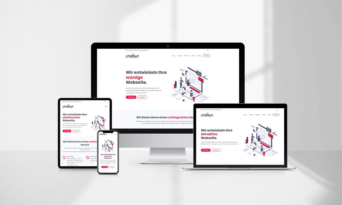
Not a lot changed from its original concept. The thought of having a website content that is equally accessible and visible on all devices, whether it's a classic PC, mobile, or a tablet, was and remained the guiding point in RWD. Another vital aspect of RWD is the code simplicity that Google’s definition of RWD describes the best:
- “Responsive web design (RWD) is a setup where the server always sends the same HTML code to all devices and CSS is used to alter the rendering of the page on the device. Google’s algorithms should be able to automatically detect this setup if all Googlebot user agents are allowed to crawl the page and its assets (CSS, JavaScript, and images). Responsive design serves all devices with the same code that adjusts for screen size.”
Last but not least, what RWD idea forced and created was the so-called “mobile-first approach”. The idea was that developers and designers need to focus on mobile users' experience when starting a new project. You first create and organize your content for the smallest devices, being smartphones, and then gradually upgrade towards tablets and desktop PCs.
CONCLUSION
 It goes without saying that the RWD approach in today’s web design is a must. Your website will simply fail to generate any meaningful traffic unless it is fully optimized for all devices. On the other hand, there are tons of benefits it provides: Statistics are merciless – more and more customers are surfing the web using smartphones. Social media visits and online shopping is practically 80% done through smartphones. Leave your website not optimized for those users, and you’ll miss a bunch of business opportunities!
SEO optimization is also unimaginable without a fully optimized and responsive website. Not having such a website means Google’s algorithm will almost definitely neglect it. And we all know that means lower ranking and subsequently fewer visits and nonexisting conversion rate.


